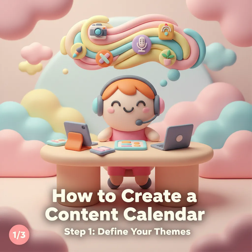
Instagram Carousel Best Practices: Design Tips That Drive Engagement
Instagram carousel posts consistently outperform single-image posts in engagement. According to multiple studies of Instagram algorithm behavior, carousels receive 1.4x more reach and 3.1x more engagement than regular feed posts. The reason is simple: carousels give people a reason to interact. Every swipe is a signal to the algorithm that your content is worth showing to more people.
But not all carousels perform equally. The design and structure of your carousel makes a massive difference in whether someone swipes past the first slide or engages with all ten. Here are the principles that separate high-performing carousels from forgettable ones.
The first slide is everything. Think of it as a headline — it needs to stop the scroll and promise value. The most effective first slides combine a bold statement or question with clean, eye-catching design. Avoid cramming too much text on the first slide. One strong headline, a visual that catches attention, and a clear indication that there's more to see (like a subtle swipe indicator or "1/7" label) is the winning formula.
Visual consistency across slides is non-negotiable. Nothing looks more amateur than a carousel where each slide has a different background color, font, or layout style. Your carousel should feel like a cohesive presentation, not a collection of separate posts thrown together. Use the same color palette, the same fonts, and a consistent layout structure throughout. This is where tools with style systems — like Phio Lab's carousel generator — save enormous time, because consistency is applied automatically rather than manually.
Content structure matters as much as visual design. The best-performing carousels follow a clear narrative arc: hook (first slide), value (middle slides), and call to action (last slide). For educational content, each slide should deliver one idea, tip, or step. Don't try to cram multiple concepts onto a single slide — the whole point of the carousel format is giving each idea room to breathe.
Typography should be large and readable. People scroll Instagram on their phones, often in environments with distractions. If your text requires zooming in, you've already lost most of your audience. Use a minimum of 24pt for body text and 36pt or larger for headlines. Limit each slide to 30-40 words maximum. White space is your friend — resist the urge to fill every inch of the slide.
Use the last slide strategically. The final slide of your carousel is prime real estate for a call to action. Ask people to save the post, share it, follow you, or visit a link. Carousels with a clear CTA on the last slide see significantly higher save rates, which is one of the strongest engagement signals for the Instagram algorithm.
One practical tip that many creators overlook: design your carousel so it works even if someone only sees the first and last slide. Some users will swipe all the way through, but others will jump from first to last. If your key message and CTA are in those two slides, you capture value from both browsing patterns.
Creating carousels used to be one of the most time-consuming parts of social media management. Designing 5-10 consistent slides in Canva or Photoshop could easily take an hour or more. AI carousel generators have changed this dramatically — you can generate a complete, styled carousel in seconds by providing the text for each slide and selecting a visual style. The time saved lets you focus on what actually matters: the quality of your ideas and the value you deliver to your audience.